Responsive website Redesign - RednBlue
RednBlue is a Panama-based logistics and online shopping company founded in 2017 that helps consumers and SMBs buy from U.S. retailers and receive their orders in Panama. The brand combines a U.S. locker address, assisted purchasing, and end-to-end shipping to make cross-border shopping simple and trustworthy.
Overview
The original site had an outdated visual design and performance issues that directly affected conversion. Despite offering competitive services in the logistics and international shopping market, the website failed to reflect the brand's value or convey trust to users. The objective was to strengthen brand positioning and improve the perception of professionalism while optimizing the site for SEO and updating the service offering.
The Challenge
Key issues identified included an outdated visual style misaligned with the brand identity, confusing navigation and unclear information architecture, poor performance and low lead generation, and a weak mobile experience. The biggest challenge was working under a very limited timeline for both design and development, which required prioritizing decisions with direct impact.
The Solution
I used a Design Thinking approach supported by Google Analytics, competitive analysis, and a review of the most-used sections from the previous website. Quick wireframes were developed, prioritizing clarity, visual hierarchy, and conversion focus. Key improvements included: a modern visual design aligned with the brand identity, incorporating illustrations and better use of color; information architecture reorganized based on user intent to make service exploration easier; scalable, reusable components designed for future growth; mobile-first approach and fully responsive design to ensure accessibility across devices; and technical optimization with faster loading speeds, SEO-friendly structure, and accessibility standards compliance.
Wireframes
Low fidelity wireframes and design iterations that guided the development process.
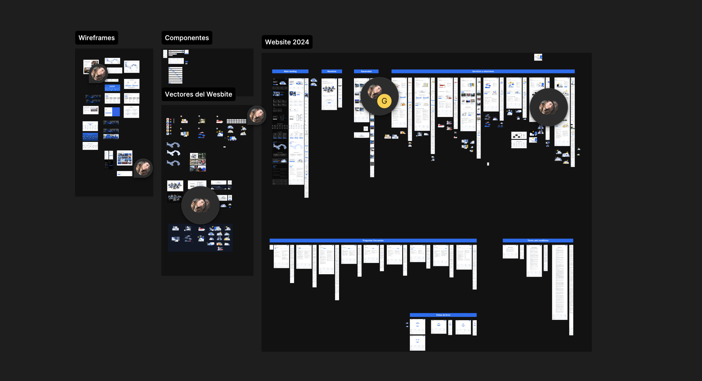
Final screens
The final design showcasing the improvements and refinements.
Key Design Improvements
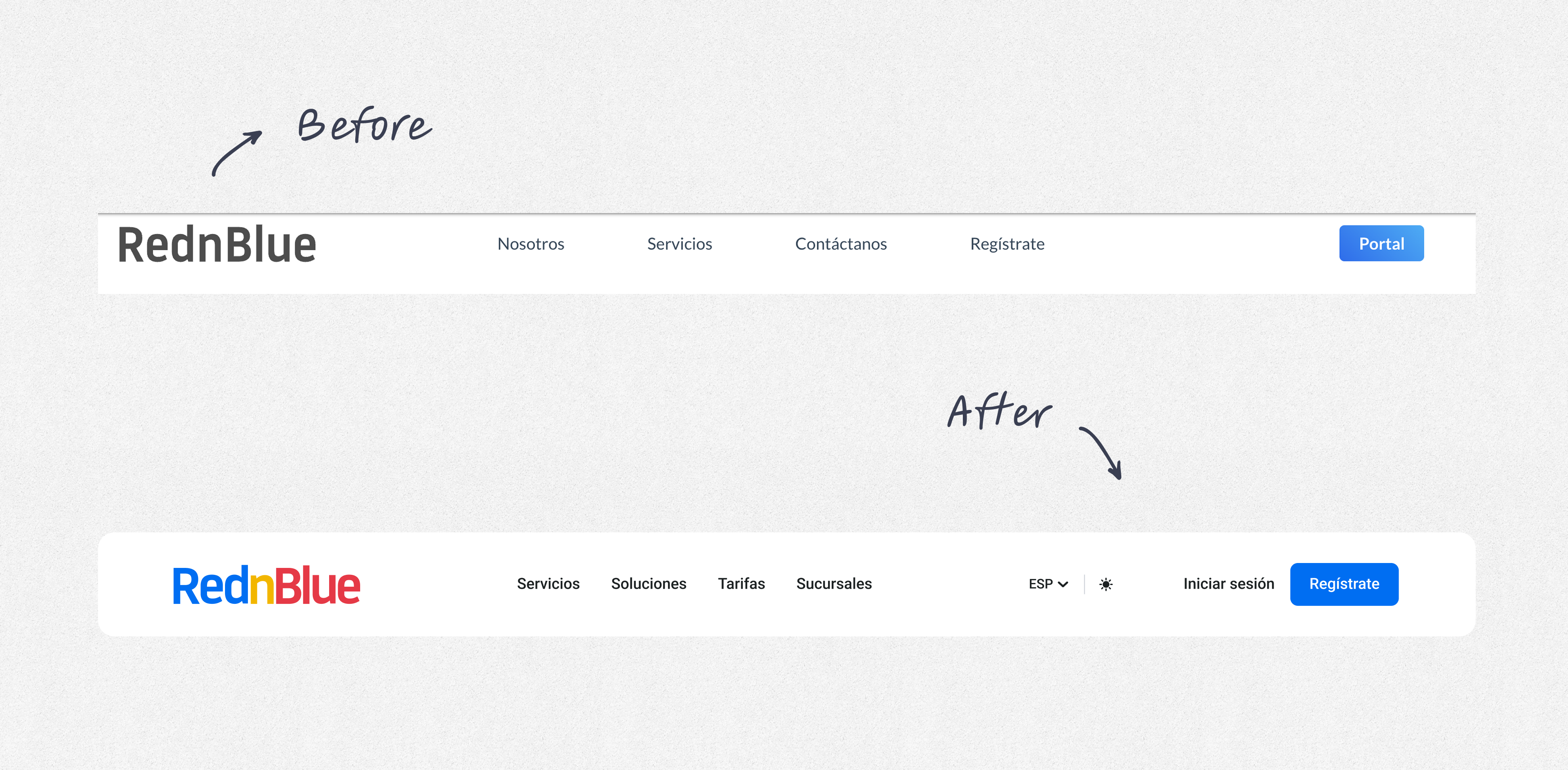
Clearer IA & Navigation
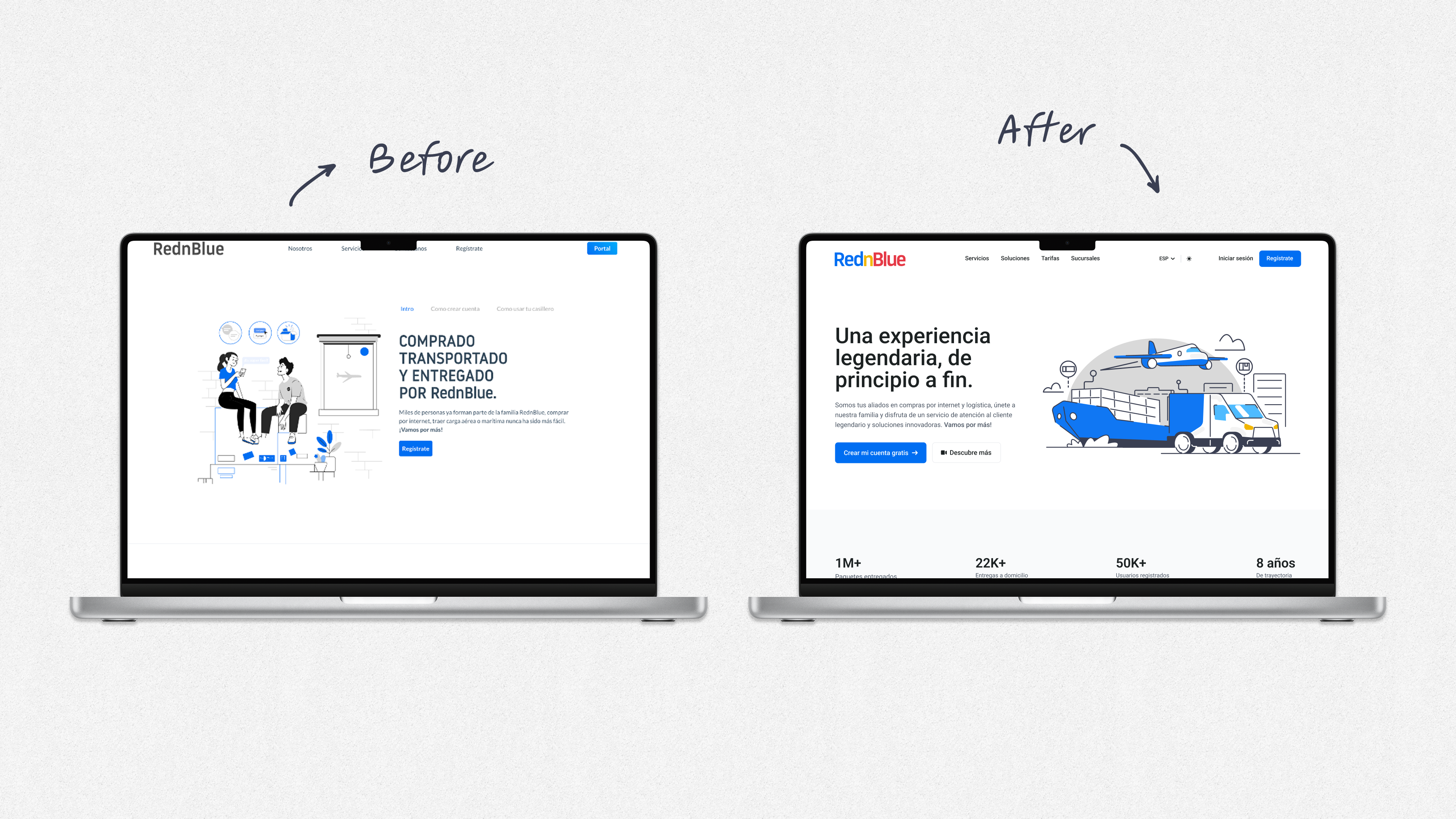
Before
Minimal top nav (Home / Servicios / Tarifas / Sucursales / Ingresar/Registrarse).
After
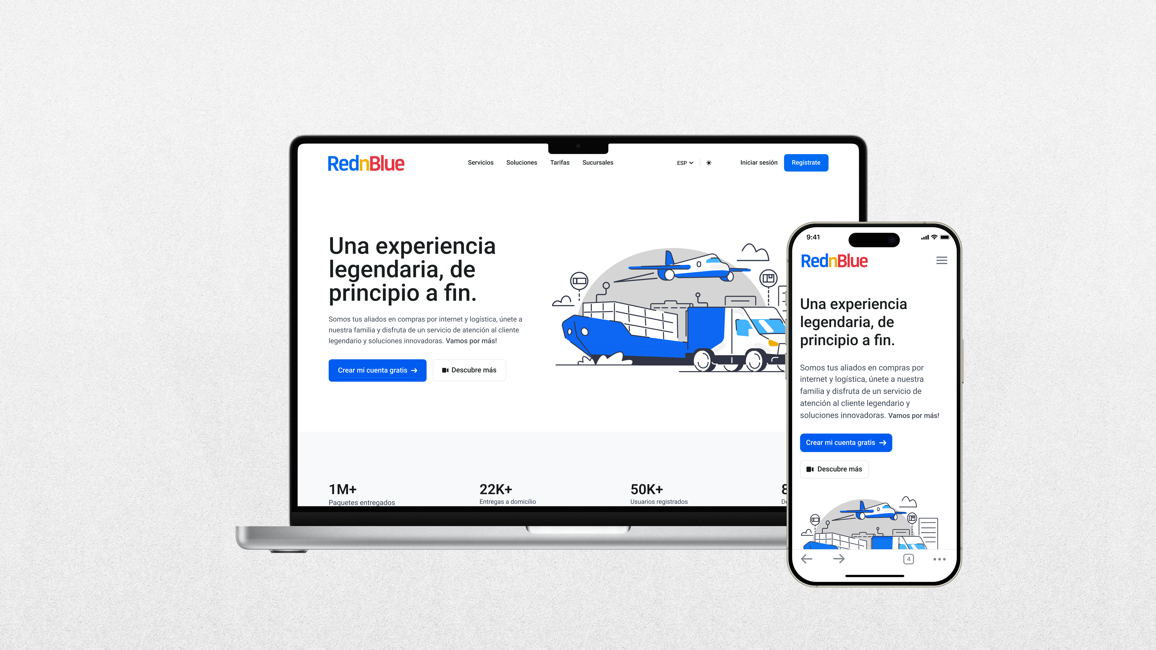
Expanded, cleaner nav with Servicios, Soluciones, Tarifas, Sucursales, language switcher (ESP), and more prominent Iniciar sesión / Regístrate. Improves wayfinding and exposes 'Soluciones' as its own pillar. Also we add dark mode for better experience in both modes.
Stronger Hero + Value Prop
Before
'Comprado, transportado y entregado por RednBlue' with a small secondary paragraph and a single CTA.
After
New illustration and headline 'Una experiencia legendaria, de principio a fin.' with a bold Comienza ahora CTA and a secondary link ('¿Cómo funciona?'). The hero copy moves from operational to experiential, increasing perceived value.
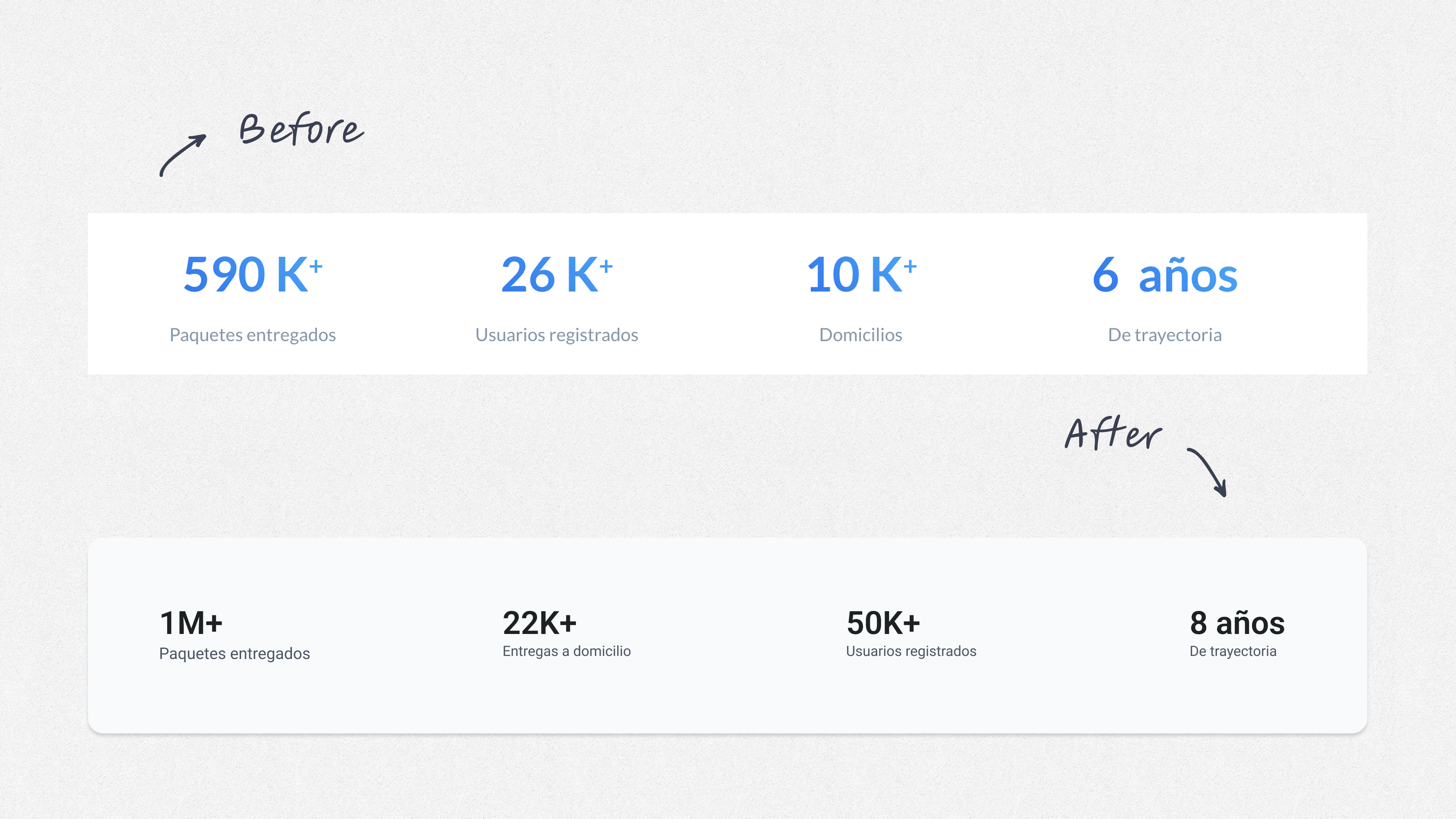
Updated Credibility Metrics
Before
590K+ paquetes enviados, 26K+ usuarios, 10K+ clientes, 6 años.
After
1M+ paquetes, 225K+ usuarios, 50K+ clientes, 8 años. Social proof is more prominent and visually consistent.
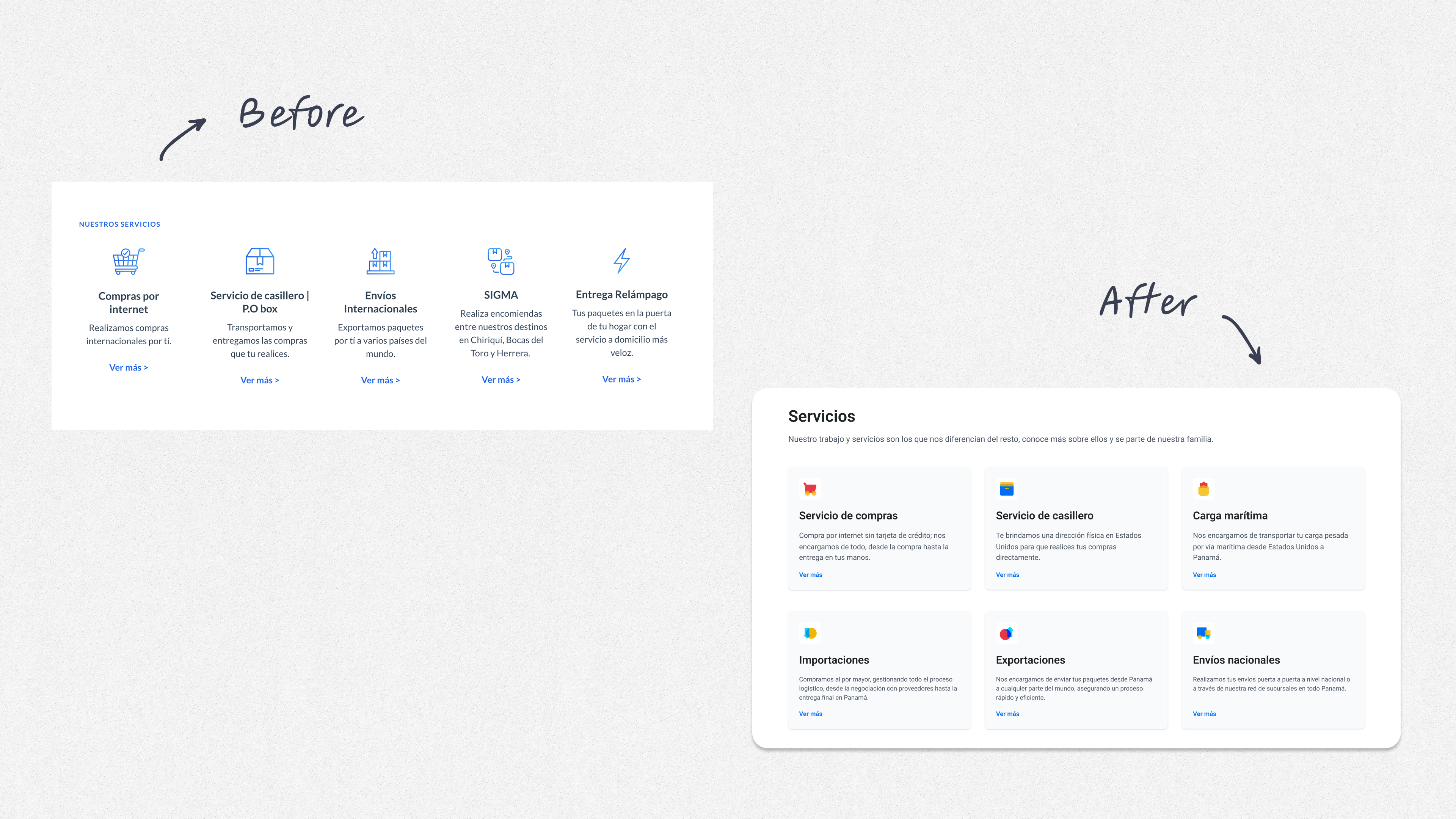
Services Are Now Scannable Cards
Before
Services existed but were buried in dense sections.
After
A grid of service cards with iconography (Servicio de compras, Casillero, Carga marítima, Importaciones, Envíos nacionales, Consolidación). Faster comprehension, better information scent.
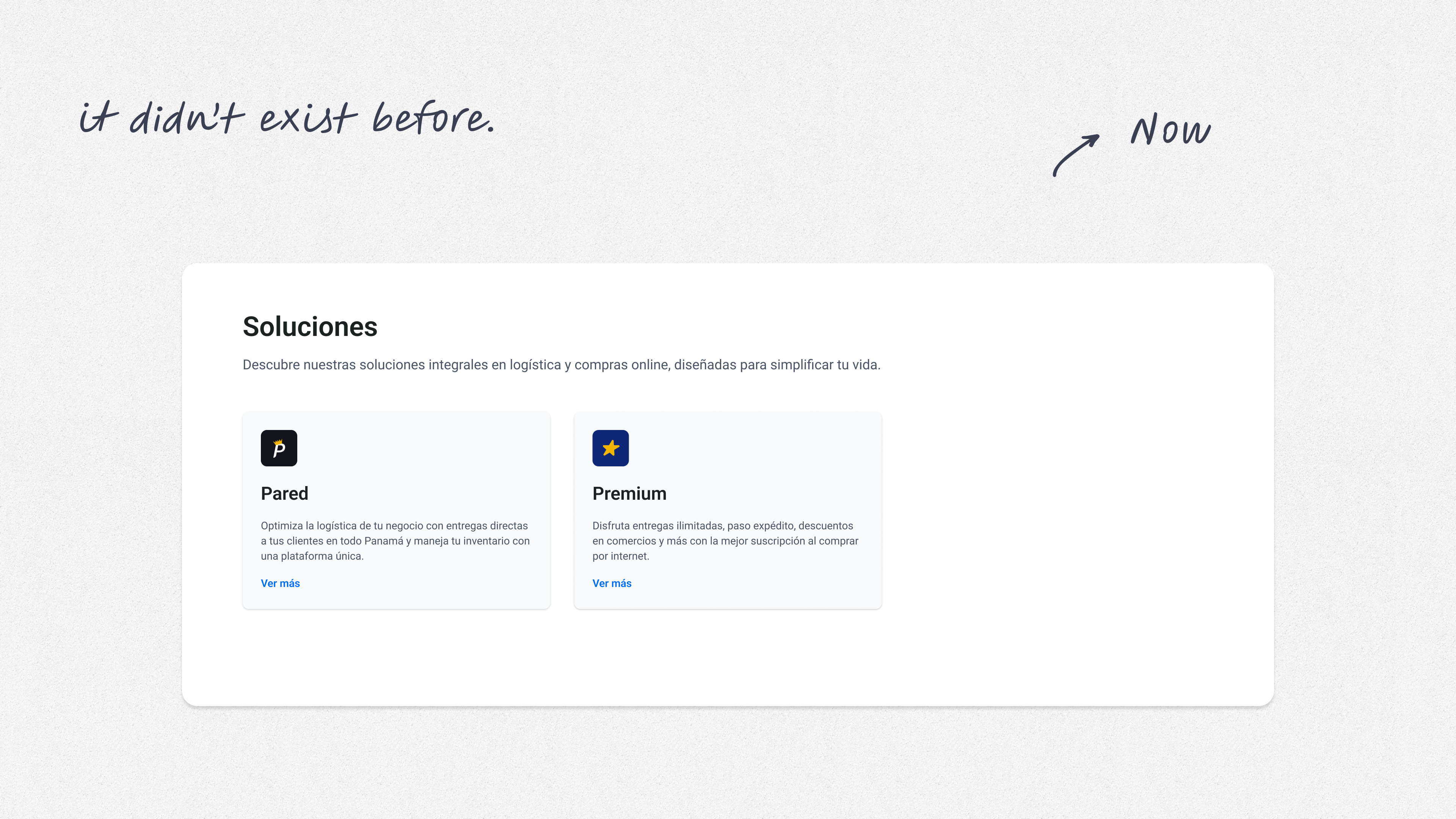
Solutions Tiering Introduced
Before
No distinct 'Soluciones' area.
After
Dedicated Soluciones cards (Pared y Premium) clarifying offerings for different needs and ACVs.
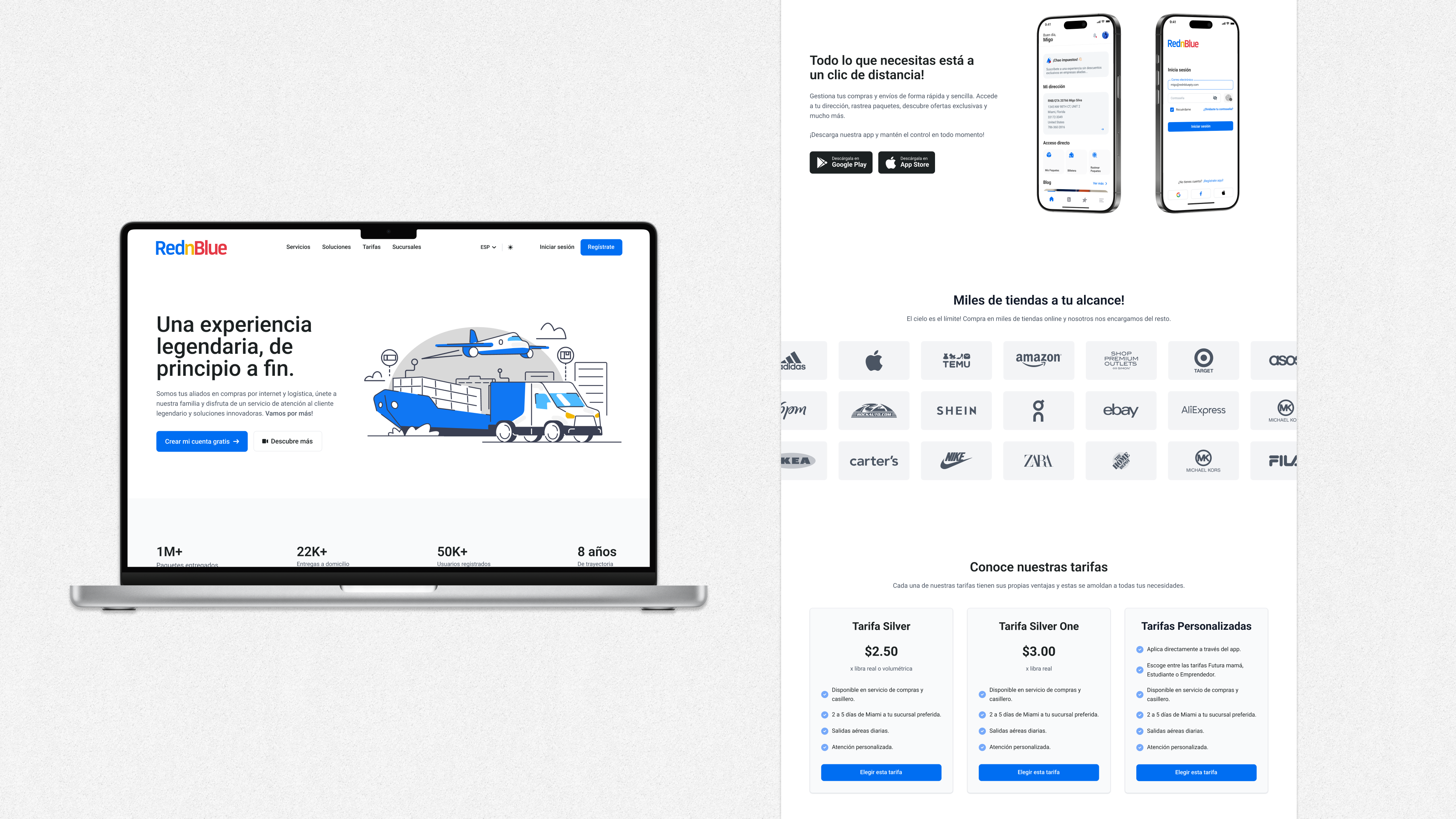
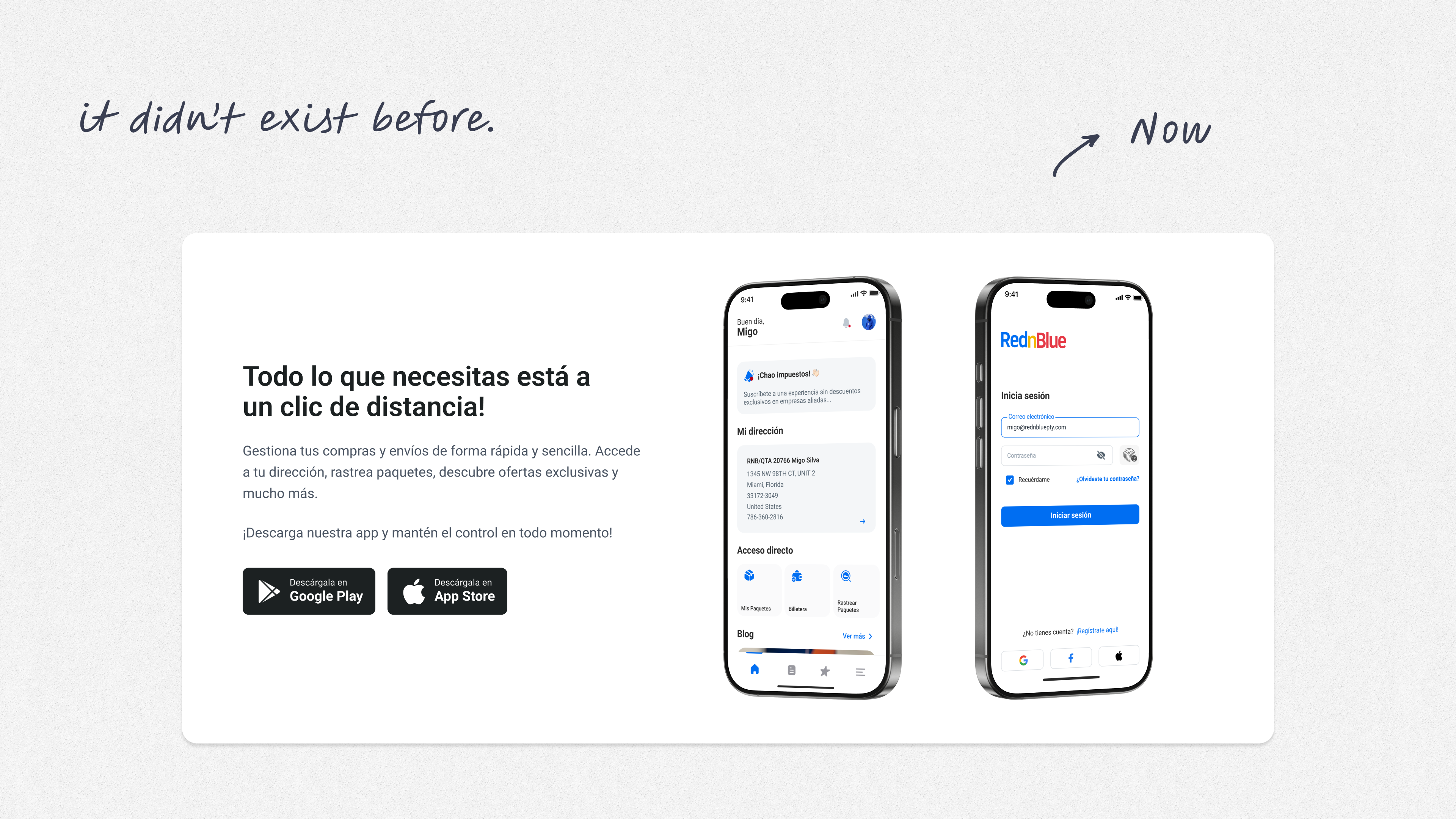
Mobile App Callout
Before
No app section.
After
App showcase with iOS/Android badges + UI mockups. Elevates product maturity and retention hooks.
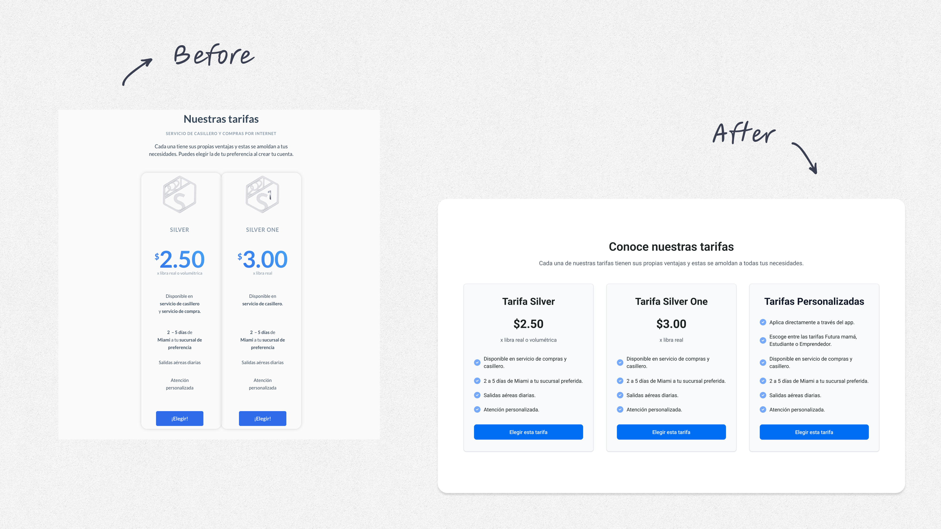
Pricing Made Comparable
Before
Two vertical cards (Silver $2.50 and Silver One $3.00) with dense bullet copy and small CTAs.
After
Three comparative pricing cards (Silver, Silver One, Tarifas Personalizadas), uniform layout, check-list benefits, strong Seleccionar CTAs. Adds an enterprise/custom tier and reduces decision friction.
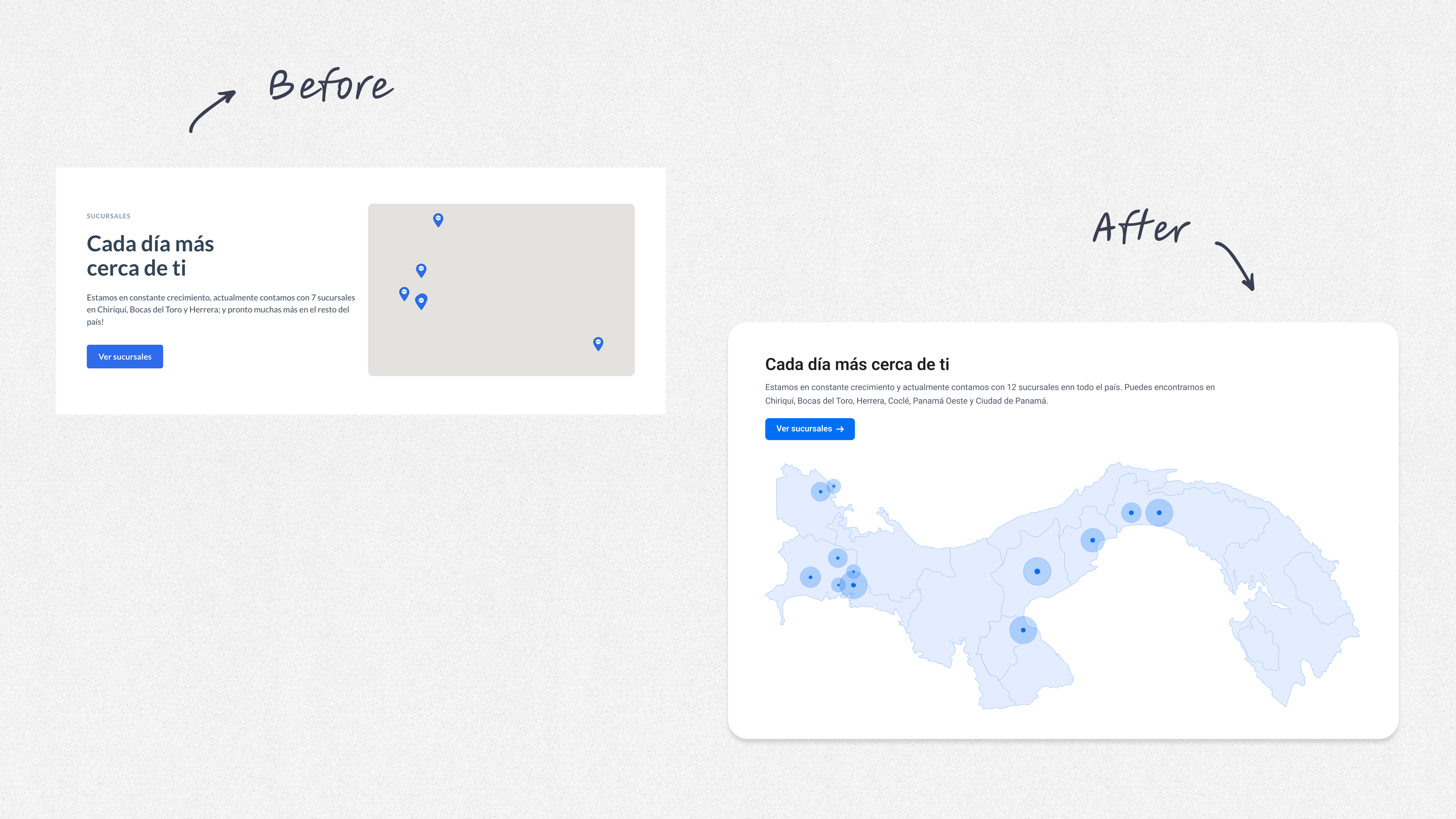
Location Proximity Visualized
Before
A generic 'cada día más cerca' copy block without clear locations to find the branches.
After
Interactive-style Panama map with city markers and an explicit Ver sucursales CTA. Helps users jump straight to a nearby branch.
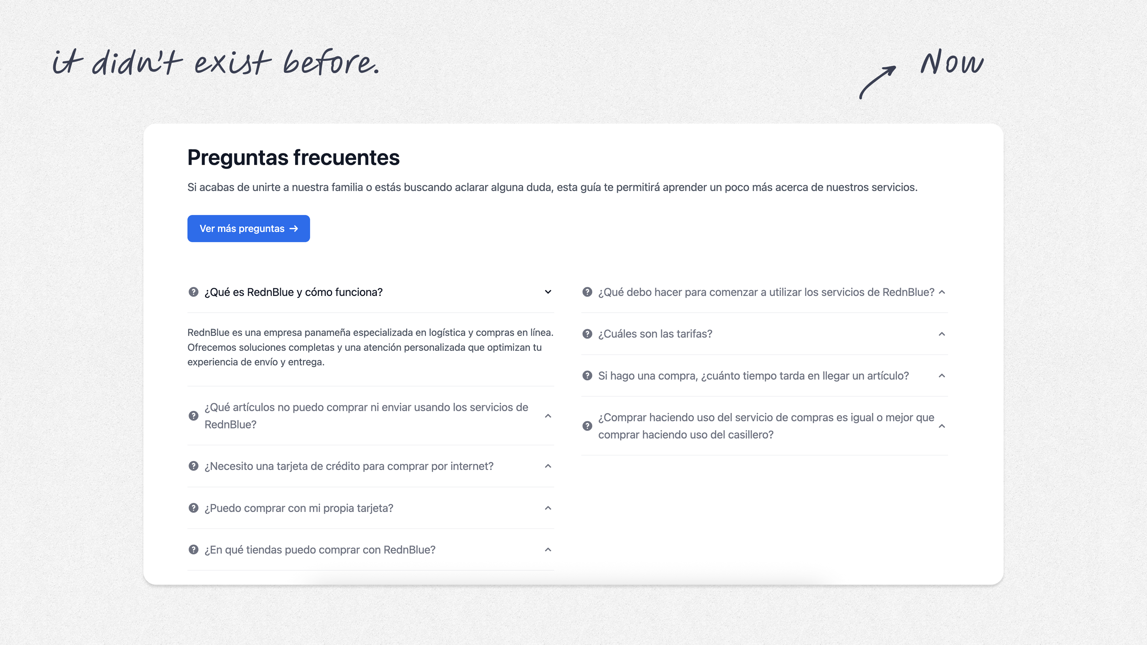
FAQ Section Added
Before
No visible FAQ on the landing.
After
Preguntas frecuentes section surfaces common objections and reduces support load.
Results
- •A fresh interface and more accurate with the new brand identity of the company
- •Clearer communication of services and solutions, including the Mobile App
- •Improved mobile experience and accessibility across devices
- •Unified components: Buttons, cards, checklists, pills, and iconography now follow a single system, reducing cognitive load.
- •Typography & spacing: Larger heading scale, increased line height, and generous spacing improve scanning and accessibility.
- •CTA strategy: Primary CTAs are singular and high-contrast (e.g., Comienza ahora, Seleccionar, Ver en Google Maps), while secondary actions appear as links—clean prioritization.
- •Visual language: Cohesive illustration style + real photos on location pages = credible + human.
- •Content strategy: Copy shifts from operational ('transportado y entregado') to outcome-driven ('experiencia de principio a fin'), adding emotional resonance.