Responsive Web Design - Zelta.dev
Position Zelta as an end-to-end partner in digital transformation (AI, development, and payments) and turn visits into qualified leads by prioritizing clarity of offering, credibility, and short conversion paths.
Overview
Zelta needed a website that clearly communicated their comprehensive digital transformation services while converting visitors into qualified leads. The challenge was to organize multiple service offerings (AI, development, payments) in a way that was both scannable and conversion-focused.
The Challenge
The main challenge was to create a clear information architecture that separated Products (Zelta suite) from Services (development, UX/UI, mobile, cloud, AI, platforms) while maintaining a cohesive user experience. The site needed to serve multiple audiences across different industries and provide quick paths to conversion.
The Solution
I designed a modern, conversion-focused website with clear navigation architecture, industry-specific use cases, and multiple conversion points. The design prioritizes clarity of offering, credibility signals, and short conversion paths throughout the user journey.
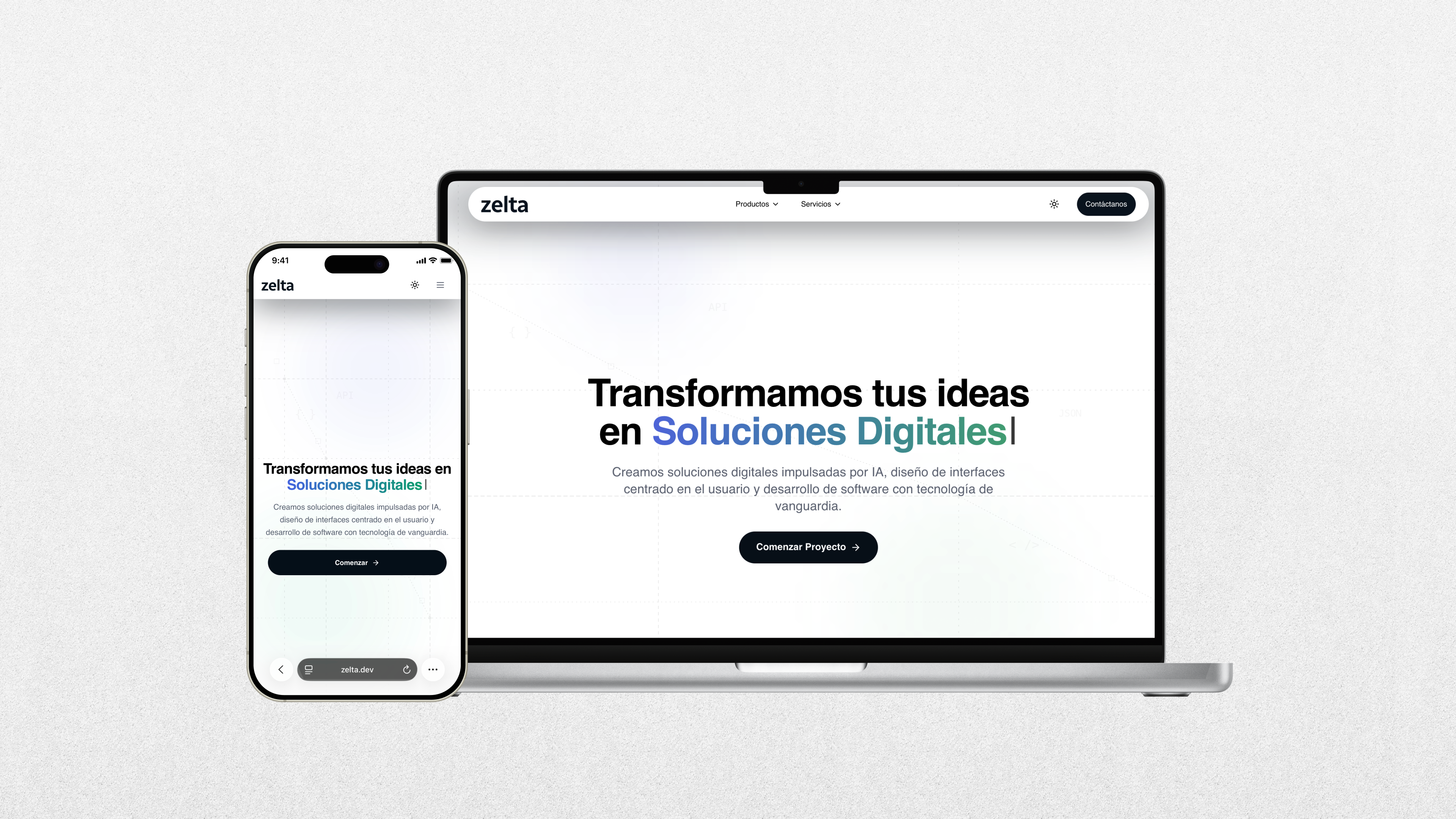
High-impact hero
Headline with a value proposition ('We turn your ideas into…') and microcopy focused on AI + design + development, with a primary button 'Get started/Start project.' Defines the proposition in 5 seconds, reduces friction, and offers an immediate CTA (acquisition-focused).
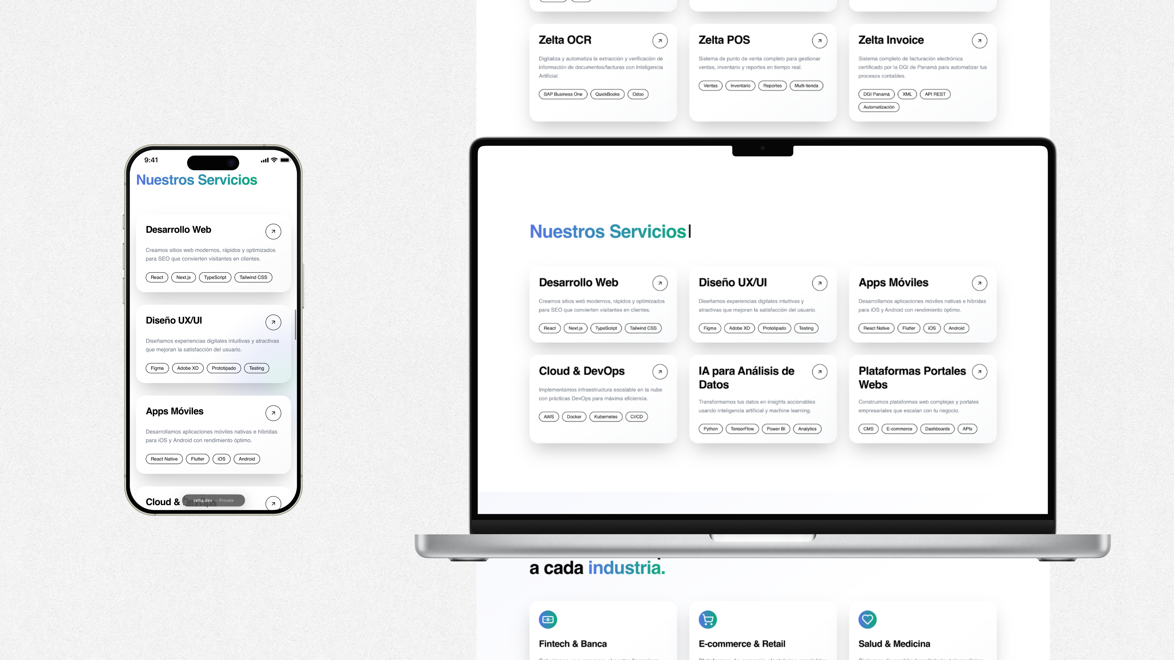
Navigation architecture: Products and Services
Simple menu clearly separating Products (Zelta suite) and Services (development, UX/UI, mobile, cloud, AI, platforms). Theme toggle and contact access. Two distinct mental paths (buy a ready product vs. hire a team). A short menu improves scannability and discovery. The toggle reinforces accessibility and visual preference.
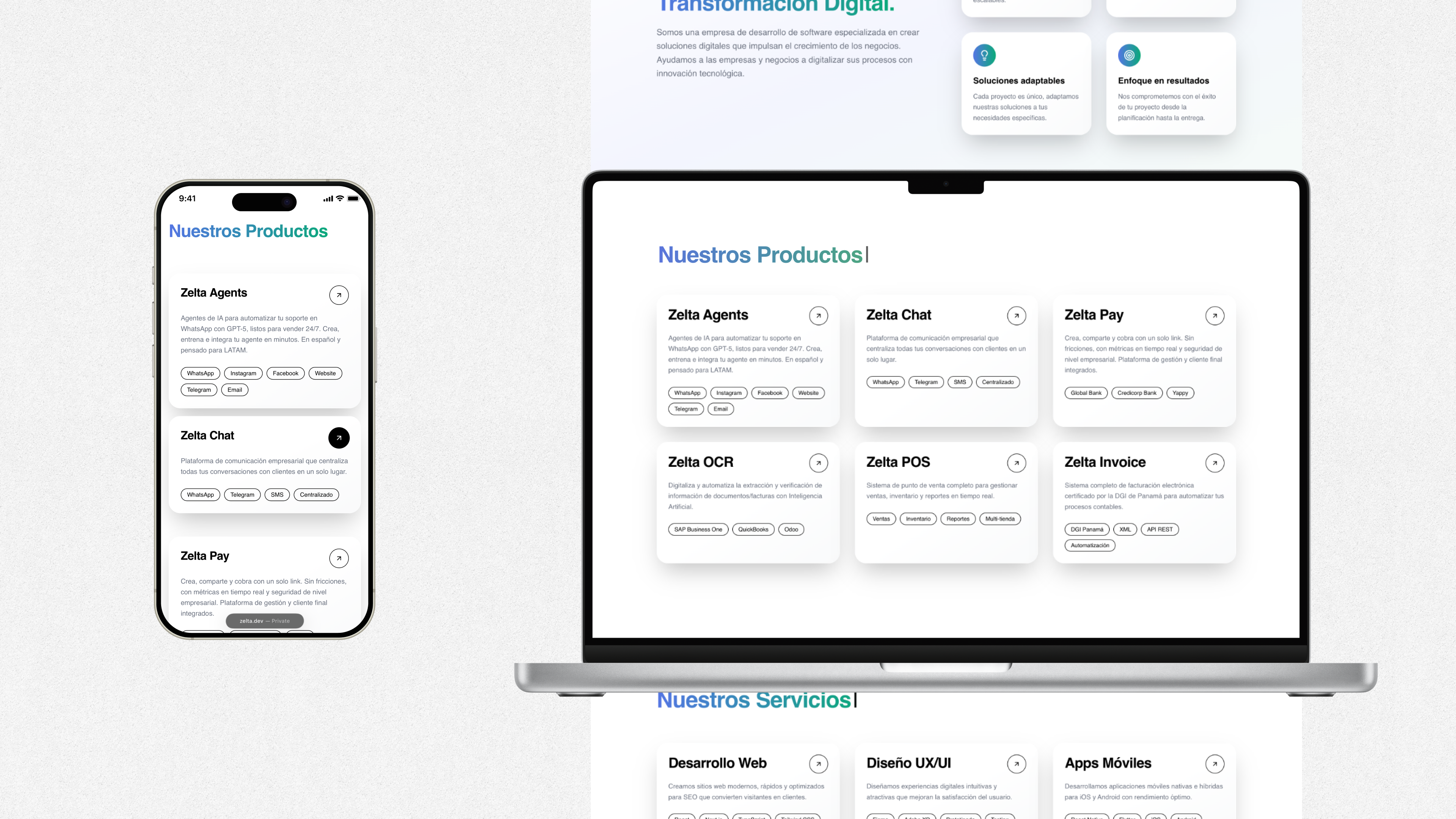
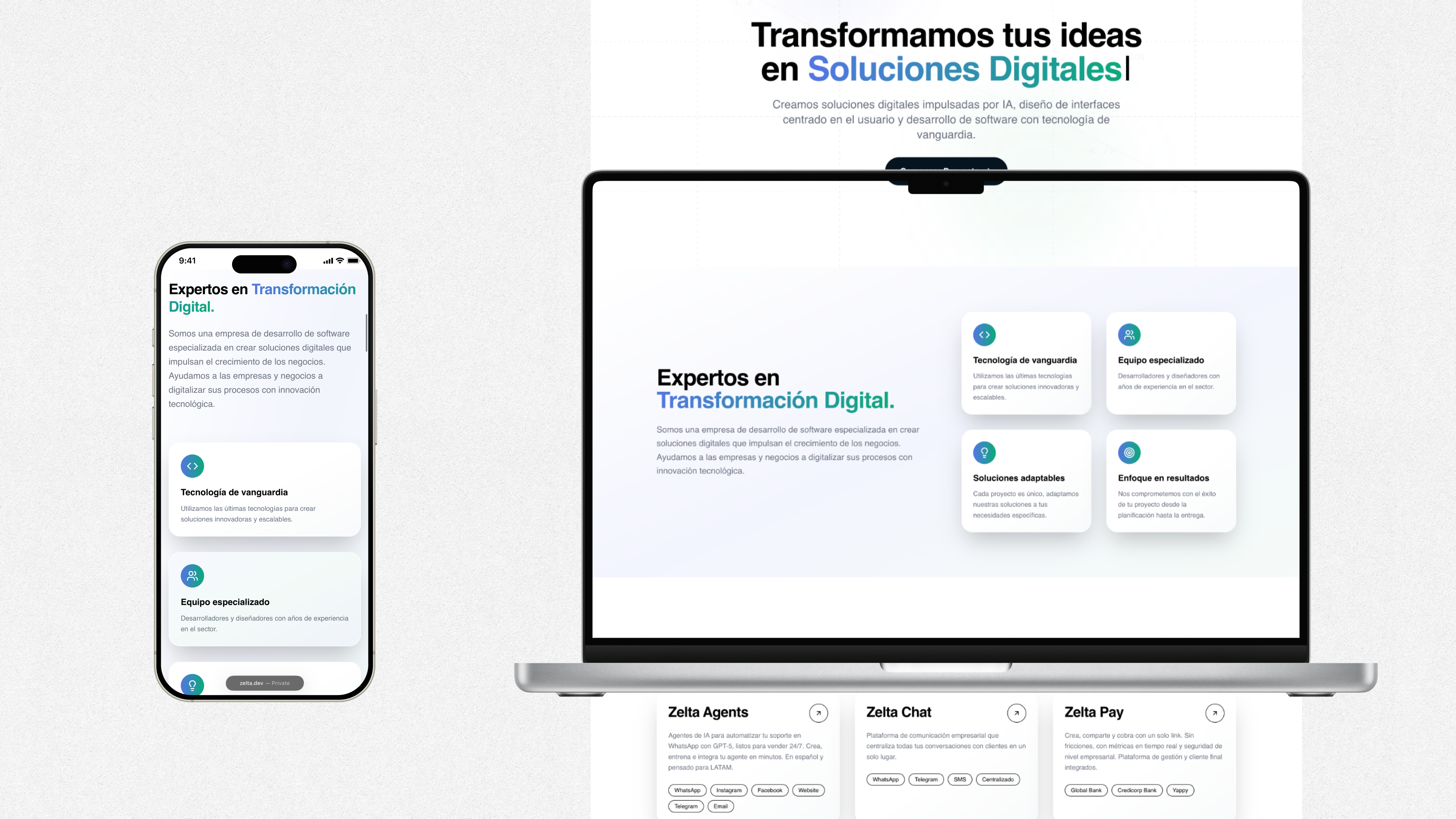
Product cards with outcomes and integrations
Each card combines outcome (e.g., 'sell 24/7'), channel (WhatsApp/Instagram/Telegram), or integrations and compliance (DGI Panama, banks, SAP/Odoo/QuickBooks). Communicating value + usage context + technical proof at a glance. Integration and compliance badges reduce perceived risk (trust/viability in LATAM). Showing the stack reduces technical doubts and speeds the fit with RFPs. The grid layout favors quick comparison by area.
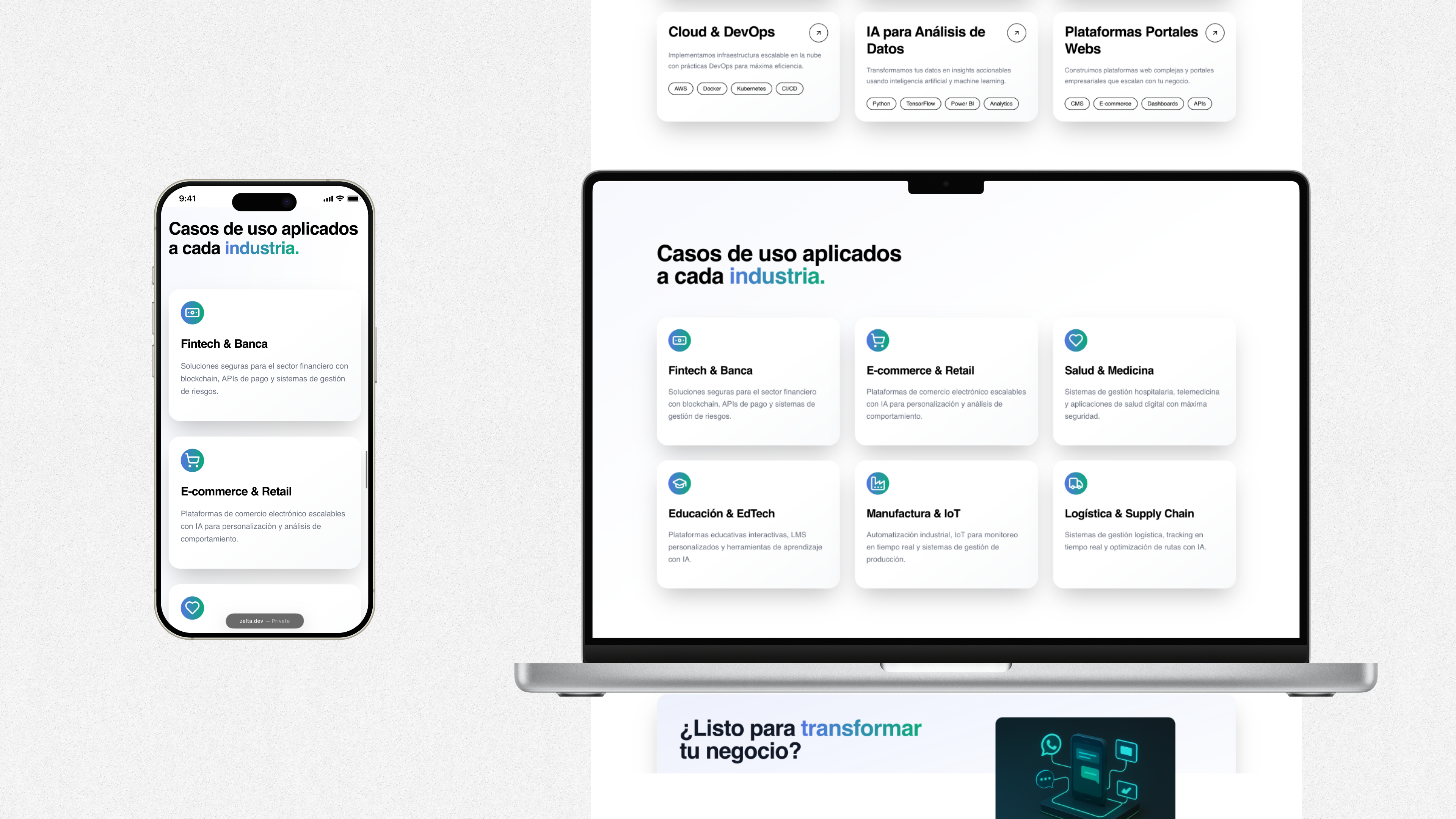
Industry use cases
Blocks by vertical (Fintech, Retail, Health, Education, Manufacturing/IoT, Logistics) describing typical solutions. This translates capabilities into real scenarios, helping the lead 'self-identify' and request a demo with examples close to their sector.
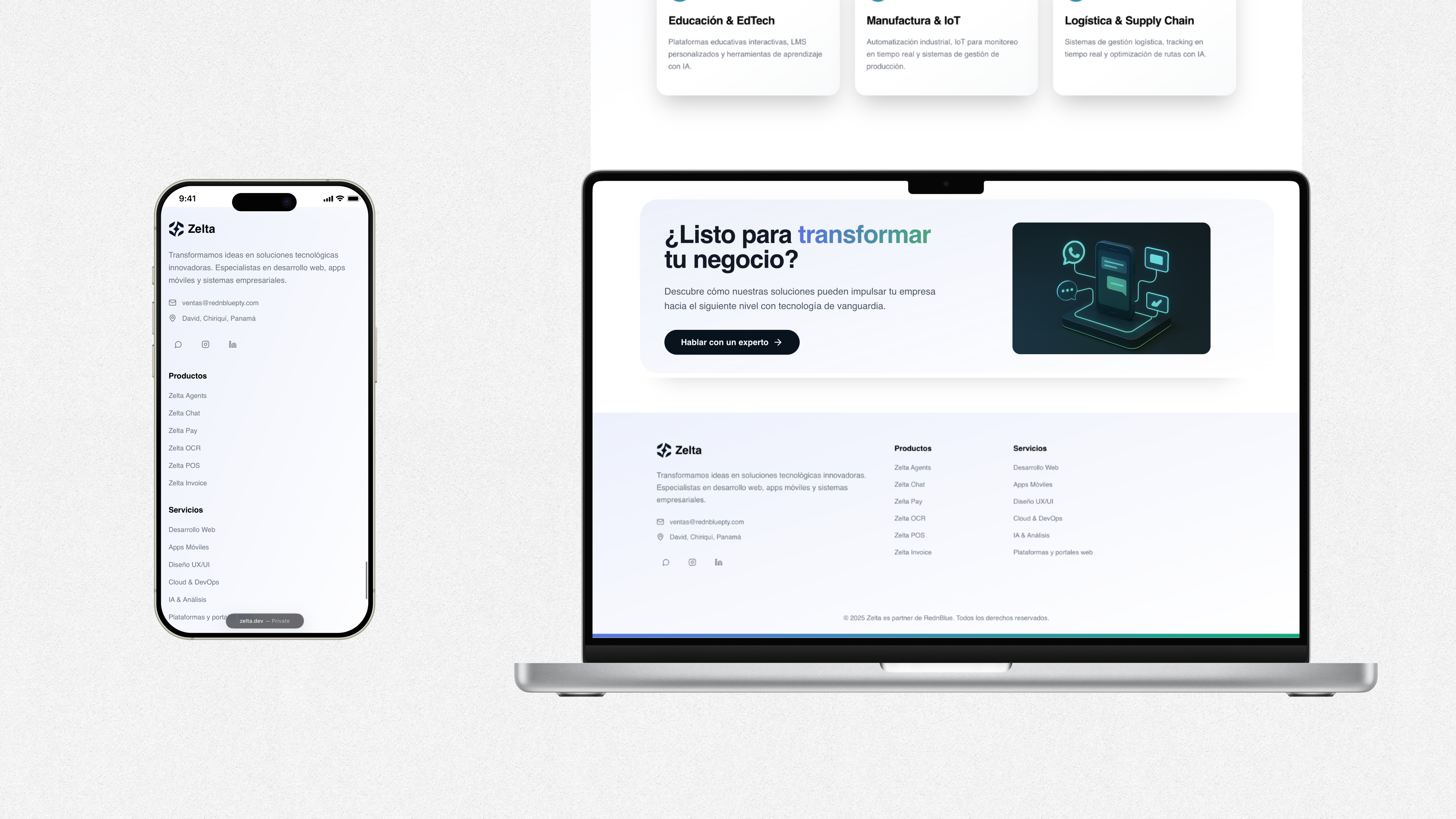
Final CTA and close
A call-to-action section before the footer creates a second conversion moment for those who need more context before reaching out.
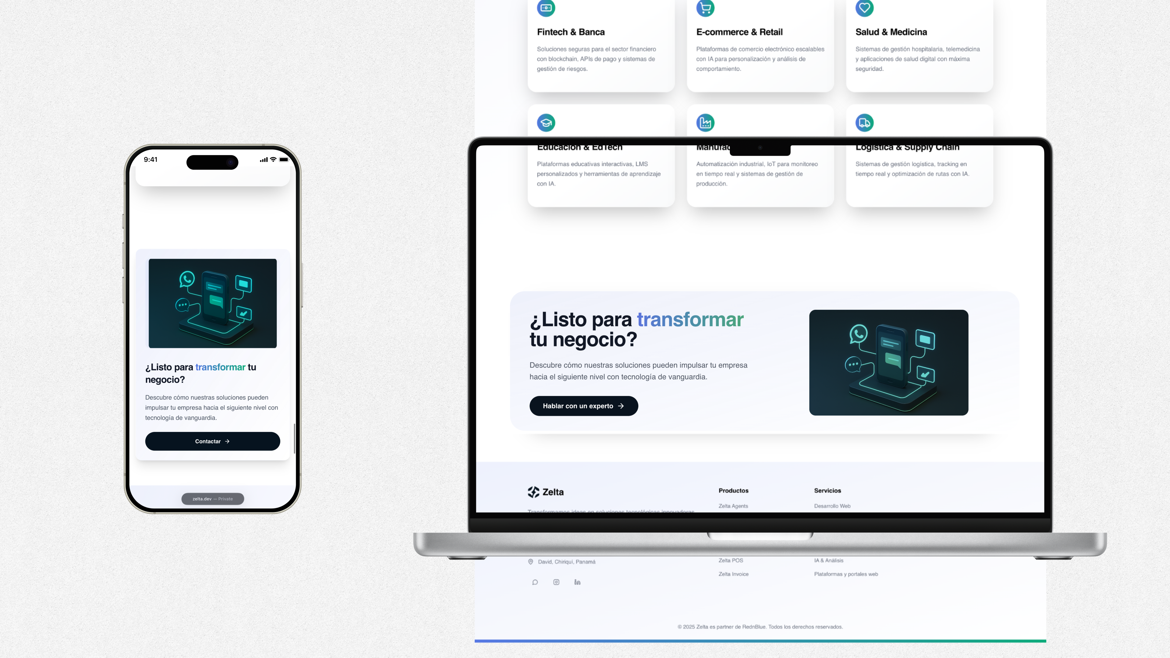
Footer with trust signals
Summary of the offering, email, location, index of products/services, and partner mention. This provides a close with verified details and a partnership that reinforces legitimacy and local support.
Results
- •Clear separation between Products and Services for better discoverability
- •Industry-specific use cases help leads self-identify
- •Clear visual hierarchy for more meaningful time on page and deeper scroll
- •Trust signals and partner mentions reinforce legitimacy
- •Cohesive iconography and optimized assets for stable LCP, reduced CLS, smoother perceived speed.